neděle 22. dubna 2012

TIM BURTON IN PARIS

For all who love Tim Burtons specific style, there is a chance to visit his retrospective exhibition at the Paris Cinémathèque

You can see plenty of sketches, models, performances and other cool stuff from this talented movie director. Exhibition runs from 7 March to 5 August 2012. You can, book tickets on the internet in advance. 

The Paris Cinémathèque is in 51 Rue de Bercy in 12th arrondissement. 
Nearest metro: Bercy

Open Monday, Wednesday and Friday 12 noon to 7pm.
Weekend, public holidays and school holidays (14 to 29 April and 4 July to 5 August): 10am to 8pm. Thursday evenings to 10pm.


sobota 14. ledna 2012

SIDONIE NÁDHERNÁ

Baroness, the muse of artists, one of the first chauffeuse in Bohemia, but also beautiful woman, very intelligent companion (she spoke Czech, German, English, and understood French and Italian) with big talent to understand and listen people.There is many others attributes how to describe this unusual women with strong life story. Her surname "Nádherná" in czech language means beautiful. We can say lot of things about her life, unusual, interesting, everything just not beautiful.

Portrait by Max Švabinský
Sidonie was born and lived in chateau Vrchotovy Janovice. She lived there with her two brothers. With her progressive way of thinking and strong love to culture, she invited many outstanding persons to chateau and with her love to nature and animals she spent  time to take care about chateau park. With her car she drove to France, where she visited atelier of August Rodin, Switzerland and Italy. She also visited North Africa and Near East.

Portrait by Max Švabinský
She inspired Max Švabinský, she was good friend with the German poet Rainer Maria Rilke. And lover of Karel Kraus (journalist, critic and publisher of magazine called "Die Fackel") During her life time, she slowly lost all and everything what she loved. 
Vrchotovy Janovice Chateau

Nazis took her chateau and later on with Red Army she lost the beautiful parc. All furniture from interiors were stolen, shrubbery and noble herbage was stolen from the park. In 1949 frustrated Sidonia crossed the border with Germany only with one piece of luggage. She ended up in England where she died one year later. A few years ago, the box with books and famous portraits of her was found in Dutch embassy in Prague.


středa 7. prosince 2011

CEZANNE ET PARIS

Till February 26, 2012 you can visit an exhibition of Paul Cézanne in Musée du Luxembourg in Paris. This collection represents the period of Cézanne's life in Paris and area nearby. 

Cezanne - la seine

Cezanne - Black Clocks

YAYOI KUSAMA - "obsessive artist"

Till January 9, 2012 you have an opportunity to see retrospective exhibition of the Japanese artist Yayoi Kusama in the Centre Pompidou in Paris. In the first floor in 5 rooms you can see collection of paintings, sculptures and performances. Two rooms became an environments where you can experience a hallucination, perhaps same as Yayoi experienced in her childhood, from which she developed the polka dot motif. 


here you can see Yayoi in action


neděle 2. října 2011

NUIT BLANCHE PARIS 2011


“The most creative and most innovative work on the French and international scenes will be here for one night” summarised Bertrand Delanoë.


It just finished white night in Paris, the night when the artists from around the world (from Quebec, Finland, Japan, Buenos Aires, Paris) will come together for the surprising and unusual night of the year. 


In different parts of Paris artists show their installations and performances. Some of the installations I perceived as very conceptual for example Marcello Maloberti's Tarzan Noir.
Artist who displayed 35 porcelain tigers.


pondělí 2. května 2011

11 for 2011


In the beginning of the year cocoon group shared thoughts on what will be the biggest trends in this part of the world – those that most affect our lives and work here in Central and Eastern Europe. The summary of 11 trends influenced by a number of macro-factors including changing lifestyles, new technologies, and global influences in design and branding. For your information (and entertainment) we’ve put 11 of these trends together in this document, which we gladly share* with interested parties, clients, and friends. 

I designed the documents layout. Gotham, as a company typeface was used.
for all trends in pdf format have a look here 


neděle 17. dubna 2011

PENGUIN BOOK COVER

Penguin is one of the most known publishing house in England, well known through its high quality cheap paperbacks. The low cost production of these books is based on cheap paper and books are usually held together with glue rather than stitches or staples.


THE BRIEF
One Hundred Years of Solitude was written by Gabriel Garcia Marquez and the book was published in 1967 in Spanish language in Columbia. Until now it has been translated into thirty-seven languages. The book is written in magical realism style and became a representative novel of Latin America literature. Format of book – paperback. Printing technique CMYK. Technical drawing, logo  and additional text for book cover was provided by Penguin.
THE BOOK STORY  
story of seven generations of the Buendía family in the town of Macondo in Columbia.
MAGICAL REALISM
Style in literature where magical elements are blended into a realistic atmosphere
ANALYSIS
Looking for symbolism and metaphors, main characters/generations – personalities/Solitude meaning/Incest/Fluidity of time/Reinforcing gender stereotypes and the connection with the Bible - One Hundred Years of Solitude draws on many of the basic narratives of the Bible, and its characters can be seen as allegorical of some major biblical figures.


COLORS - Yellow and gold are the most frequently used colors in the book and they symbolize imperialism and the Spanish Golden Age. Gold signifies a search for economic wealth, where yellow represents death, change and destruction.


Golden fish – family symbol. Pigs tail – incest sign
Golden fish with pigs tail is a magical realism symbol


FINAL DESIGN


NEGATIVES 
higher production price. I didn’t keep the technical drawing provided by Penguin. After research between paperback designs I decided to add an extended flap to cover design. I appreciate the practical function of the flap. For variation with golden fish I recommended golden hot foil even if the specification in the brief was CMYK. The golden hot foil can support better visibility on the book shelf and make book cover more attractive to consumer. Design can be also adjusted in provided technical drawing and fish can be printed with gradient simulation.
POSITIVES 
less colors. In case of hot foil book cover can be printed only with 3 colors - Yellow/orange/black


pondělí 28. března 2011

ACADEMY OF FINE ARTS

Last two days I went to the Academy of Fine Arts. The academy was founded in 1799 and it is the Czech Republics oldest art college. I had the opportunity to visit the atelier of Prof. Jiří Sopko and to have a look at some Filip Horyna and Václav Misař  works (you can also find some of their paintings on naugallery). Thanks to my close friend Bára, Filip will paint a portrait of Lenka and me.


pondělí 21. března 2011

ROYAL MAIL POSTAGE STAMPS

I just submitted my designs of postage stamps for Royal Mail UK.
The brief was - celebrate the idea of ‘firsts’ and create stamps that inspire the nation whilst instilling national pride. 

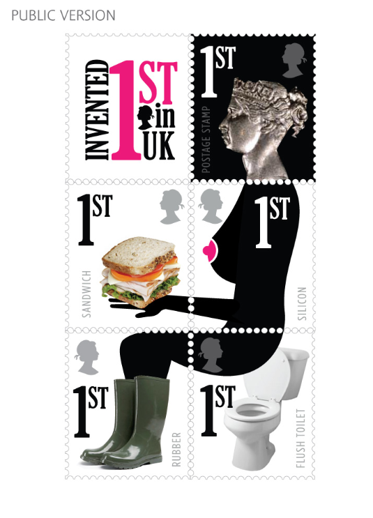
Since the beginning I saw a good challenge in bringing a new and fresh concept, trying to do not only propose a collection of historical cliché. My work begun with a documentary research of English inventions. What was originally created in England? How English inventions did manage to influence people and future generations´ lifestyle? I rapidly realized that many inventions have been already celebrated by the Royal mail postage stamps. The celebrated inventions were from many different areas such as astronomy, chemistry, engineering or medicine. At this time, I have collected a lot of information and I have decided to focus on important inventions but not the most famous ones that come instantaneously to our mind such as telephones’ invention by Graham Bell or Thomas Edison’s light bulb invention. I would like to avoid a déjà vu impression and also that people smile when they look at the stamps. I have chosen 5 inventions, which I found representative enough 


PENNY BLACK – the world's first adhesive postage stamp used in a public postal system. The profile bust of Queen Victoria was pictured on the black background. 
SILICON  - invented by professor Frederic Kippling, English chemist. 
SANDWICH - was invented by Lord John Montague Sandwich (1718-1792). He created sandwich food because it allowed him to continue playing cards while eating, without getting his cards greasy. 
WELLINGTONS – were invented by Arthur Wellesley (19th century) and became a fashion rage! Wellies became popular with farmers who could keep their feet dry and mud-free while working on farms. 
FLUSH TOILET/WATER CLOSET  – current look was invented by Sir John Harrington in 1596. Thanks to this guy you now take comfort that your needs are taken care of. 


After the inventions selection I would like to connect them in one story/picture, which you can currently see on my designs. All stamps contain information -1st and black head of the Queen. I have also developed collector’s edition with explanation of all inventions with dates and timeline. There is also a simulation which explains and shows stamps process, with an additional picture. It is possible for people to upload it. 

Some people could be offended regarding my designs because its place the queen in an unusual posture. To prevent it, post stamps are sent separately one from an other, so penny black head will hardly be sent with toilet on the same letter. I have also tried to represent visually the English sense of humor.

here some of the ideas which were developed further or killed... 


pátek 25. února 2011

WOLFF OLINS - PWC

I just spent one week in London and back in Prague full of inspiration and ideas I am ready to create some cool stuff again.
I had an opportunity to meet Londons top brand and corporate designers and typographs. One of them currently participated on the brand new identity of PriceWaterhouseCoopers.
Chris Yeo, also the author of new logo for wacom tablets (I am sure well known between designers) currently freelance for Wolff Olins. See the great introducing video here


http://www.wolffolins.com/